Veoci · Lead Designer
Designing the first AI chatbot for an enterprise emergency management platform
A new feature in a high-stakes environment
Veoci is an enterprise platform built for emergency management. Cities, hospitals, universities, and government agencies run their operations and incident response through it.
When the team decided to build an AI chatbot into the platform, the developers had already made most of the backend connections. My role was everything in between the user and the model. That means the flows, the visual design, and the interaction patterns.
Getting answers from the platform was slow and manual
Getting data out of Veoci meant navigating a complex UI, manually pulling reports, and relying on administrators to run queries on your behalf.
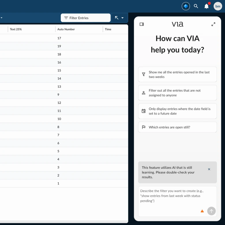
The chatbot was meant to change that.Query data, automate workflows, and answer operational questions in quickly, from a single conversational interface. The problem was figuring out what that actually looked like for three very different users.
Three personas. One interface.
Veoci's user base isn't uniform. The platform serves a chain of people with very different needs and very different relationships with data.
Jim
The Builder
Creates the forms, workflows, and reports that everyone else uses. Knows Veoci deeply.
Tom
The Operator
Field responder working off what Jim built. Doesn't need to understand the platform just needs it to get out of his way.
Jane
The Decision-Maker
Briefing elected officials and executive leadership. Needs data she can trust, fast enough to be relevant.
The AI chatbot had to work for all three.
Flow mapping first, pixels second
AI chat interfaces are deceptively simple. But underneath are dozens of interaction decisions.
We started with flow mapping and whiteboarding. Working with the engineering lead, and senior design director, we mapped the full conversation architecture. Finding what paths a user could take, where the AI could branch, and where the experience could break down. We spent our time defining the rules of the interaction itself.
From there I moved into Figma with annotated wireframes and moved to high fidelity mockups. AI played a big role in creating interactive prototypes fast that could be pressure-tested in stakeholder reviews and iterated on with developers during build.
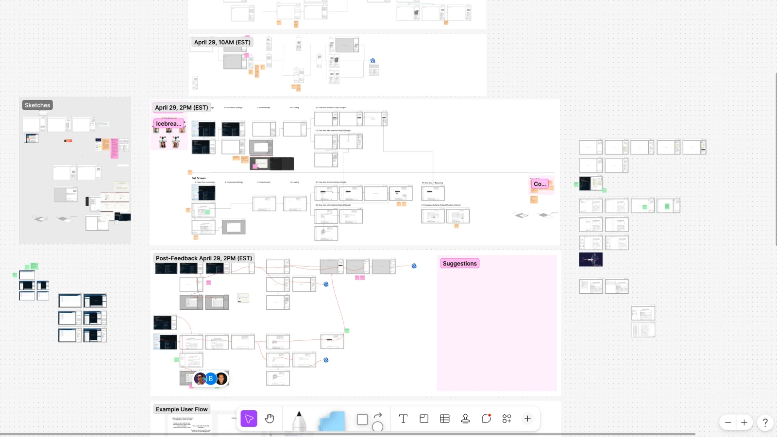
Flow mapping the full conversation architecture.
The interaction problems that required the most thinking
The pre-build summary. The lead engineer, who had deep AI experience, believed pushed for a prebuild summary as a means of saving token usage and preventing expensive queries before the goal of the chat was clear. My job was to map the interaction and tune the quantity of information the user would recieve to land in that goldy locks zone of just enough information. The result was a confirmation stage: the AI summarizes what it's about to do, what data it will use, and waits for the user to confirm, adjust, or cancel before executing anything consequential.
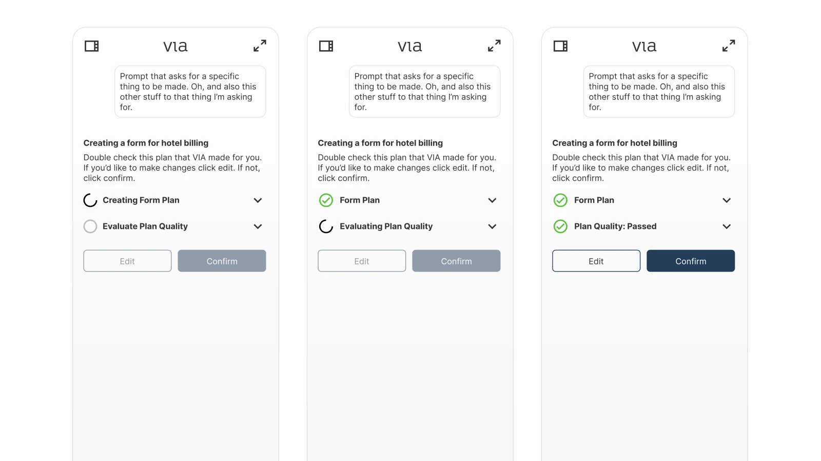
The pre-build summary.
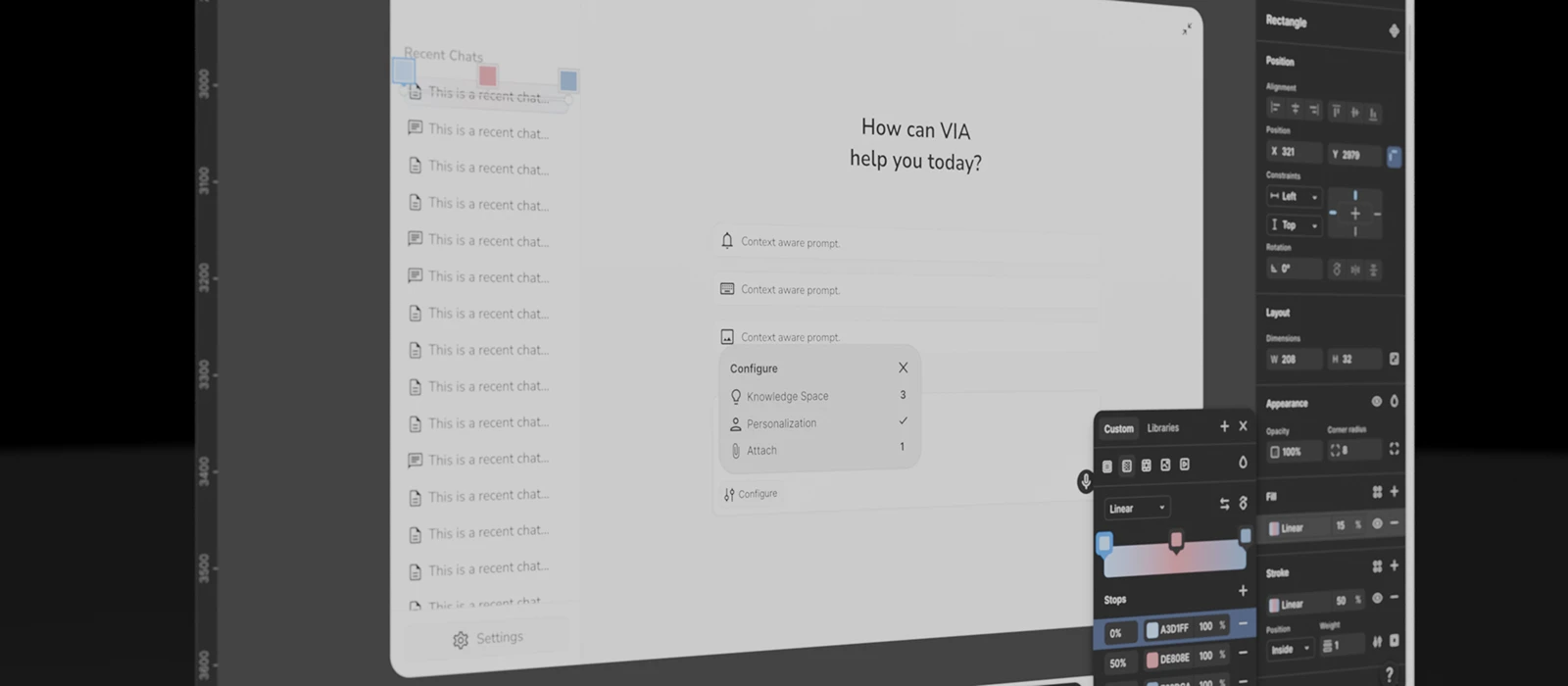
Knowledge spaces. Connecting the chatbot to specific datasets users had added to Veoci meant solving both a visibility problem and cost problem: Querying huge amounts of data is expensive. How do we make user actions more precise? How do you make it clear which data the AI is actually working with, without overwhelming the conversation interface? This required careful decisions about hierarchy and when to show versus when to hide that context.
The context menu problem. The chatbot wasn't just a text interface. We wanted it to be useful. users could add files, connect knowledge spaces, apply personas, and more. Early instinct was to surface each action individually. That created clutter. The more capabilities we added, meant more interface and more confusion.
We landed on a single unified button that created one entry point that expanded into all available actions. At the time, placing that many functions behind one control felt problematic. That pattern has since become close to standard in AI chat interfaces.
File attachments and the full state inventory. Here's a look at a beatiful figma version of that menu. Of course thats not what ultimately got designed. But still happy to share it.
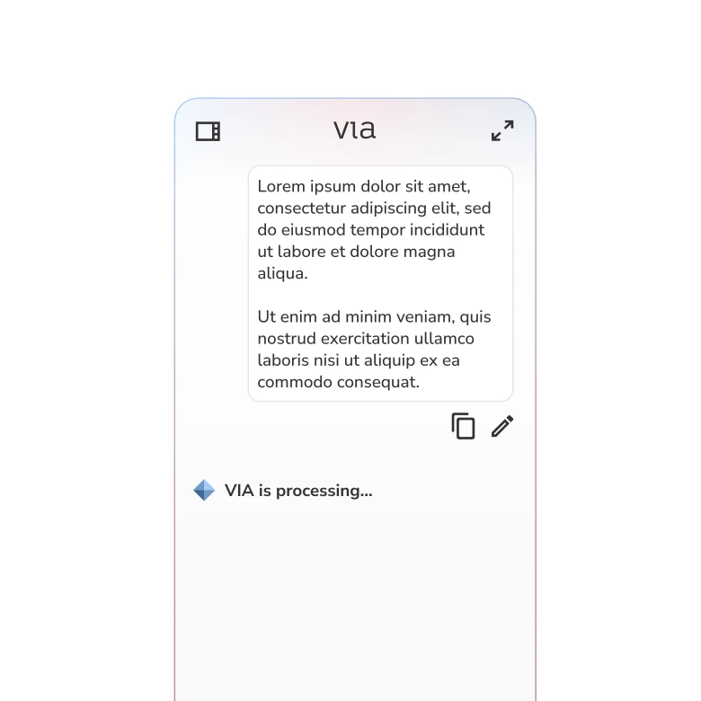
Unique processing states to indicate to the user that their query is being processed.
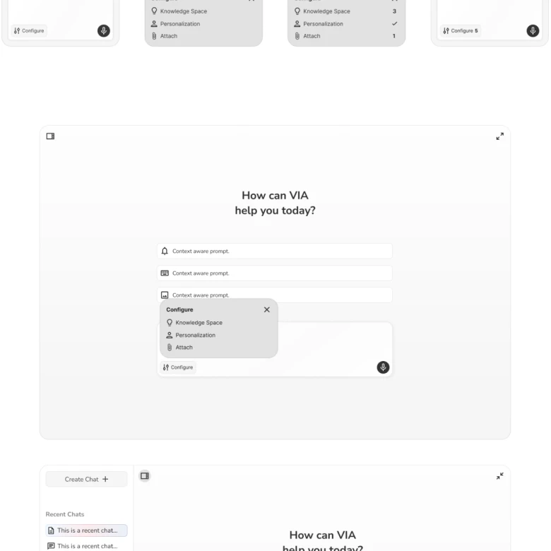
File attachment, agents, and knowledge spaces.
More control, better outcomes
Going in, the assumption was that users wanted the AI to handle as much as possible with minimal input. What we learned was the opposite.
"Users who had more control over the AI got better outcomes."
Users who could steer the AI, adjust it mid-conversation, and set context before execution got better results. Smaller, more targeted prompts with richer context outperformed broad open-ended ones every time.
Launched to a controlled release and a larger rework already underway
After 3–6 months of flow mapping, prototyping, and iterating in lockstep with engineering, the Veoci AI chatbot launched to a controlled release to internal teams and a select group of existing enterprise customers who volunteered to be first.
The shipped product included the full interaction system: the unified context menu, the pre-build confirmation stage, knowledge space connections, file attachments, and a complete set of loading, error, and empty states all visually consistent with Veoci's existing platform language.
Some interactions were rough at launch. Known issues were shipped intentionally to hit the deadline, and visual design inconsistencies made it through. A larger rework is now underway giving developers better tools and reworking the platform with everything we learned from the first version.
The shipped interface, the foundation the current rework is building on.