InEight · Lead UX/UI Designer
Redesigning a BIM application and increasing user engagement by 30%
A powerful product that users were quietly walking away from
InEight Model is a BIM tool built for construction professionals collaborating on complex 3D projects through their full lifecycle. It's a capable piece of software. The problem was that almost nobody knew it.
Sales were slowing. Contract renewals were declining. When the team went to find out why, the answer was consistent: Model was outdated and had become too hard to use. Years of feature additions had made it clunky, hard to navigate, and difficult to master. Users were leaving for competitors with simpler interfaces with less functionality.
"We'd get feature requests for things the product could already do, users just couldn't find them."
Autodesk was winning on documentation and clean UX. Procore was winning in the field with mobile. We were losing on both fronts.
Listening to the users who already left
We started where the answers were, talking with users who had already churned. Qualitative interviews with former customers gave us an unfiltered view of what wasn't working. We paired that with a competitive analysis of Autodesk and Procore to understand what users were finding on the other side.
The patterns that emerged were clear:
- Feature discoverability was broken. The ribbon hid functionality behind layers of nested menus. Users gave up looking.
- Core tools were painful to use. Measurement and sectioning required too many steps.
- The UI was inconsistent. Panels, menus, and dialogs had evolved independently and felt like three different products.
- There was no mobile story. Field workers had no way to access or update a model on-site.
Two years of weekly iteration, shipped in layers
The redesign wasn't a single handoff it was two years of weekly collaboration with developers, product managers, and stakeholders. Four major workstreams ran in parallel.
Track 01
Toolbar Redesign
Brought core functionality into the user's field of view. Followed legacy menu patterns to ease the transition for existing users.
Track 02
Tool Reworks
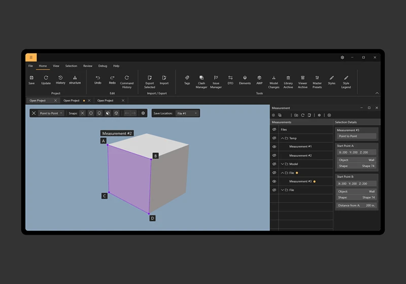
Ground-up redesign of measurement and sectioning, the most-used and most-complained-about tools in the product.
Track 03
UI Unification
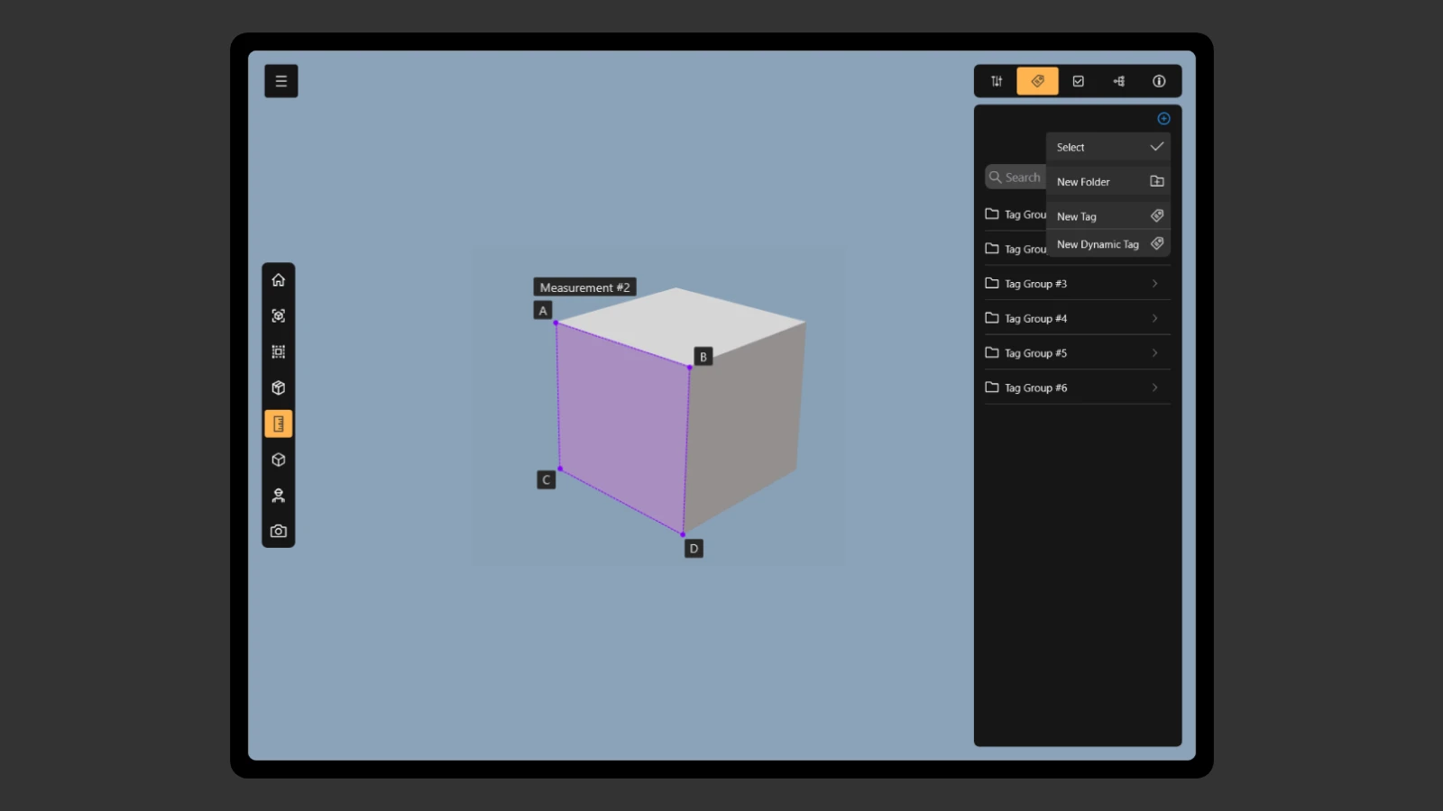
Built a consistent design language across all panels, menus, and dialogs. Documented it as the Desktop Style Guide.
Track 04
Mobile App
Designed a companion mobile app from scratch, letting field workers access and update models on-site for the first time.
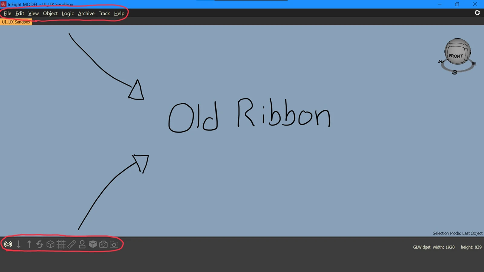
Before: The old ribbon buried functionality behind layers of nested menus.
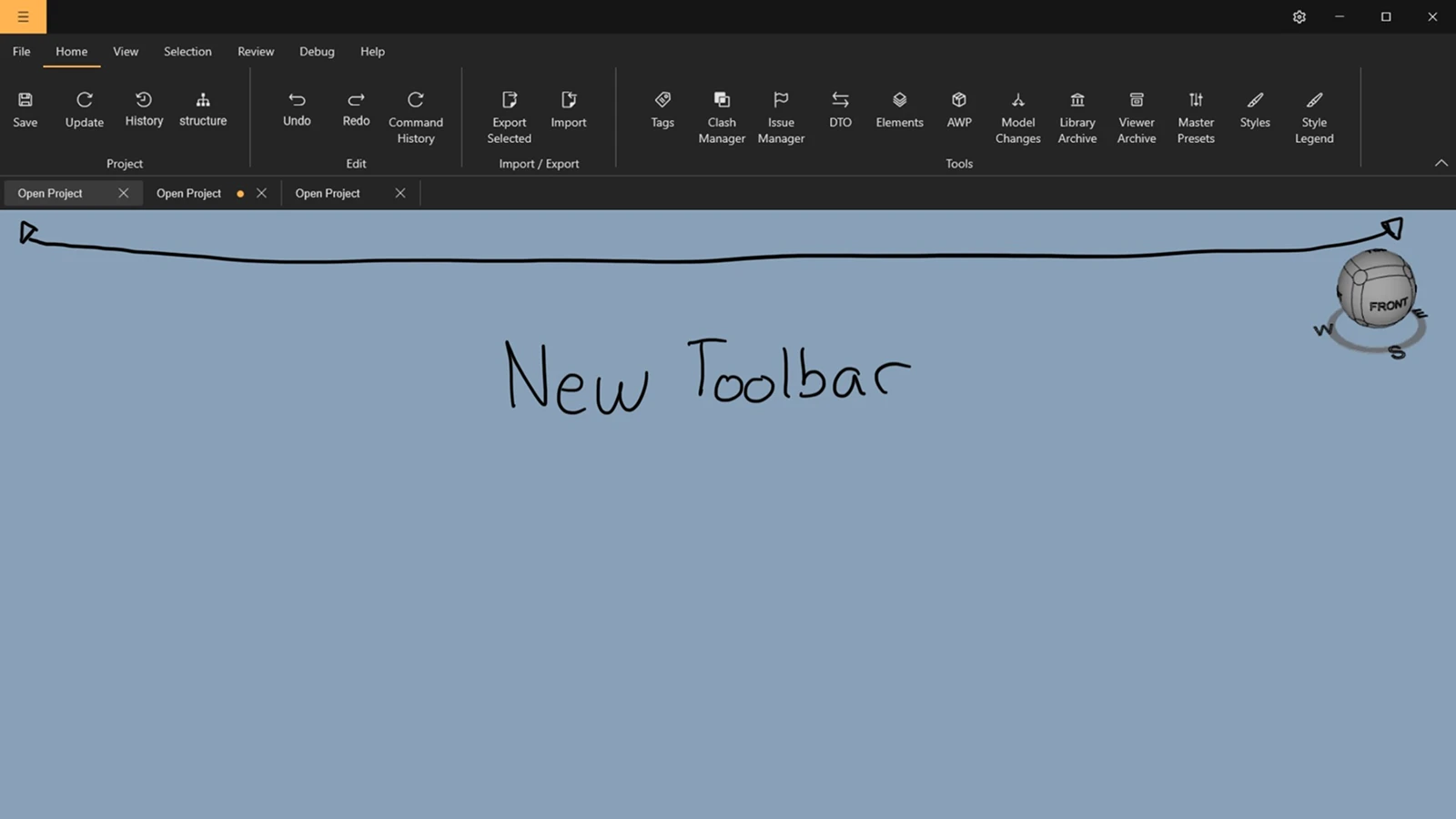
After: The new toolbar puts core actions in direct view, with toolbar extensions for context-sensitive controls.
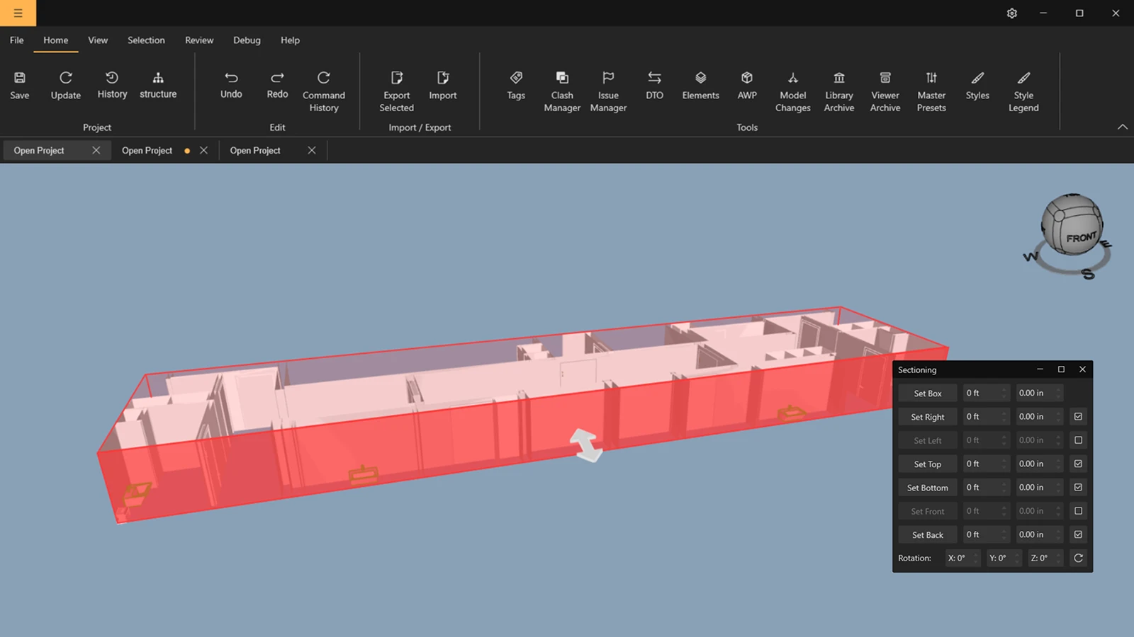
Sectioning: replaced a complex dialog with direct drag handles on the model.
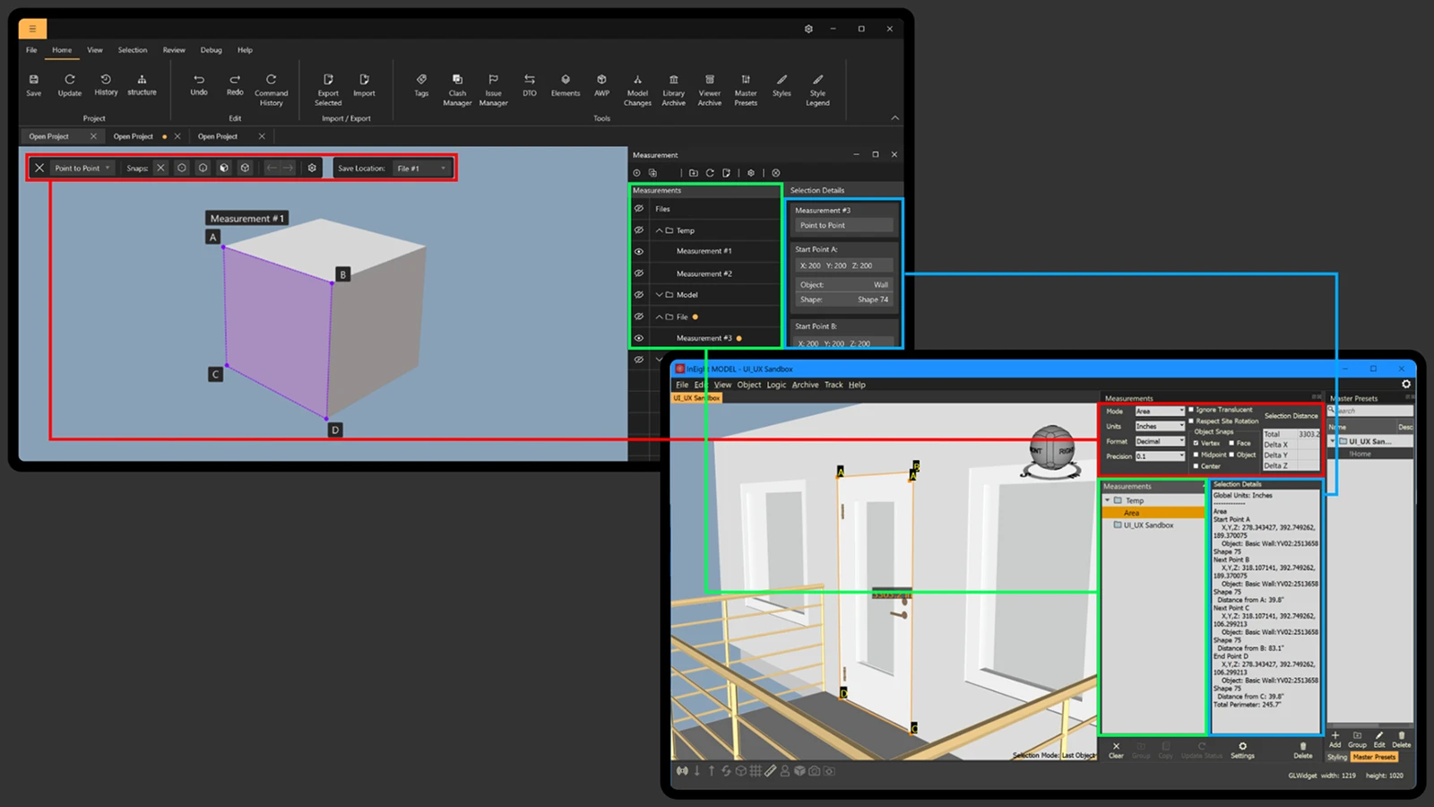
Measurement: rebuilt from the ground up after user feedback surfaced deep usability issues.
The mobile companion app a new capability that directly answered what Procore was winning on.
Users stayed — and told us why
At the end of the project we ran a round of user interviews to measure impact. 90% of users cited the design changes as a primary reason for renewing their contracts. Overall engagement with the product increased by 30%.
The toolbar redesign, in particular, had a measurable effect on feature adoption. Users were discovering and using capabilities they hadn't known existed, which was the core problem we'd set out to solve.
The Formwork design system produced before this work also became a foundation for the desktop style guide.