Student Portal Redesign
UX/UI Designer
Student Portal
BYU - Idaho
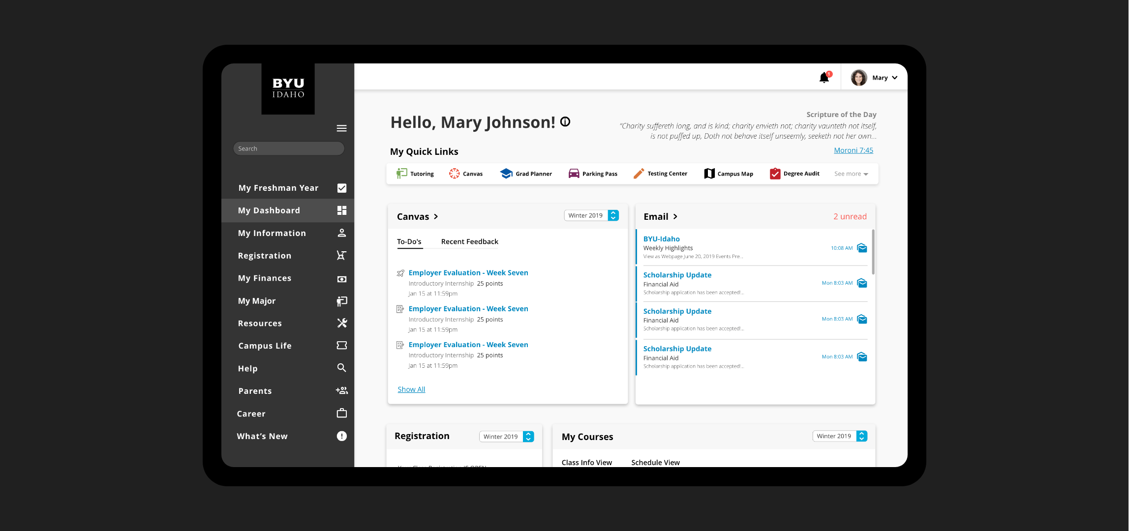
The BYU-I Student Portal redesign was a project meant to improve on the current student portal beta. I was part of a team of designers that was following the Lean UX process. We implemented improvements incrementally and by applying user feedback and confirming design choices through continuous user testing we were able to move forward with a more functional design.
With the information we gathered we were able to conclude that students were confused about the location of certain features and they felt the beta made basic tasks overly complicated. This made it hard to navigate and complete basic tasks that otherwise wouldn't have been very difficult using previous methods. There was also quite a bit of feedback talking about the all-white design being hard to read. Our main goal was to fix the overall navigation and to create a better visual design system.

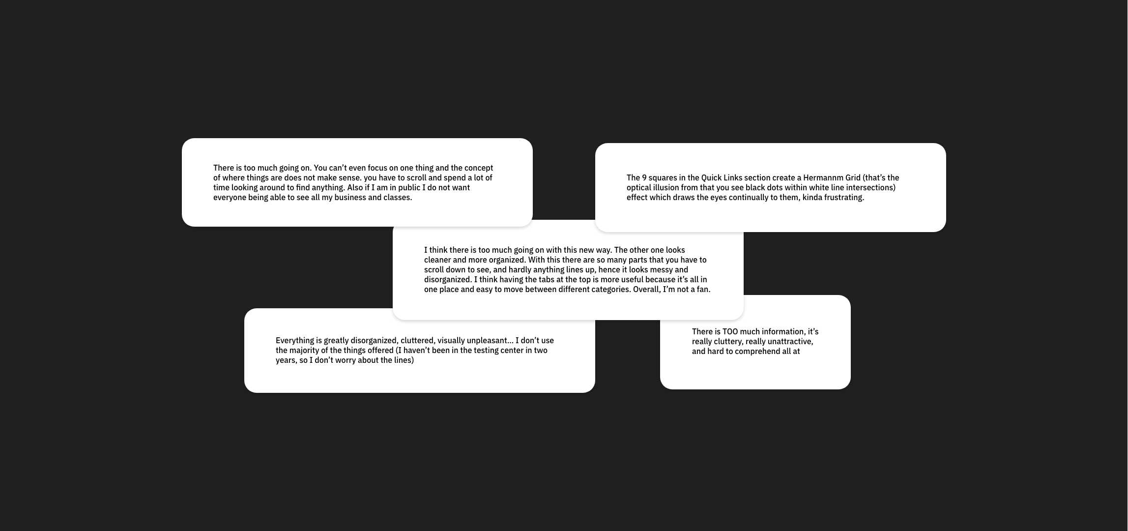
Our project started by analyzing feedback from the launch of our Student Portal Beta the semester previously. It became apparent quickly that students weren't responding well to the changes that had been made. After reviewing the feedback we found the biggest issues to be information architecture (students felt the portal beta was too complex) and the design (feedback stated the design was hard to read and straining to look at).
As a team we analyzed the first issue. We started by looking at the analytics of the previous student portal to try and understand why students felt that the portal had been made too complex. In the old portal analytics, we found that a lot of students were not using the links found on the portal itself rather they were using other methods to get where they needed.
As a team, we unanimously agreed that something could be done to the design to help it feel less cluttered, more organized and, less straining on the eyes. We concluded that the visual design needed to be based on navigation and organization would solve the core issues.
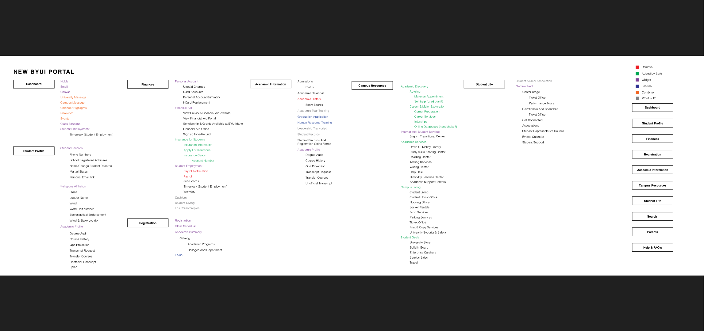
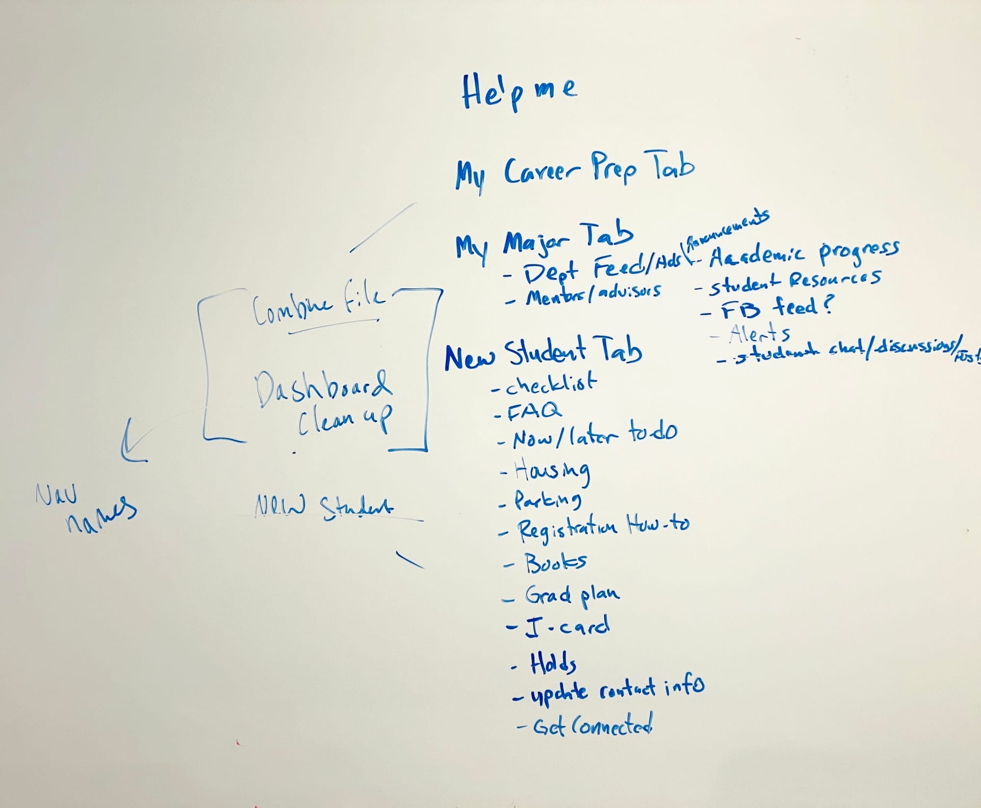
We took a look at the information architecture of the old portal to see if anything had been lost during the last redesign. We then carefully mapped out which links were most important based on student needs and separated them into sections that would serve as the main pages in our redesigned student portal.
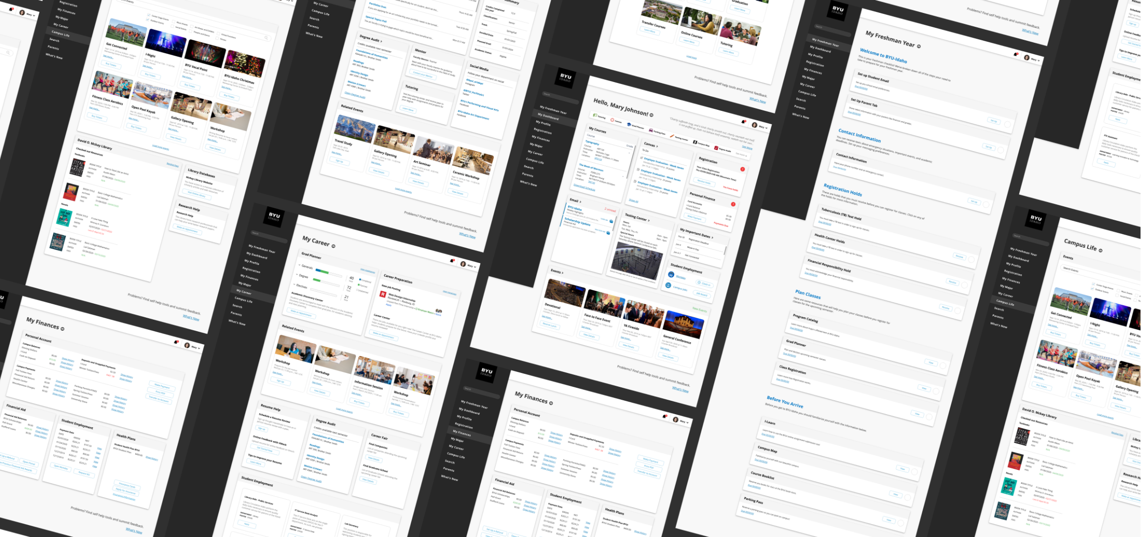
With an idea of how we would organize our pages we began our first design sprint to come up with some ideas of where we could take the new student portal visual. We focused our attention on creating organization and clarity through our design.
We started our design sprint with a brainstorming session to help us hash out what we'd like to change in the new version of the portal. We were able to come up with a good direction that would act as a springboard for our designs.
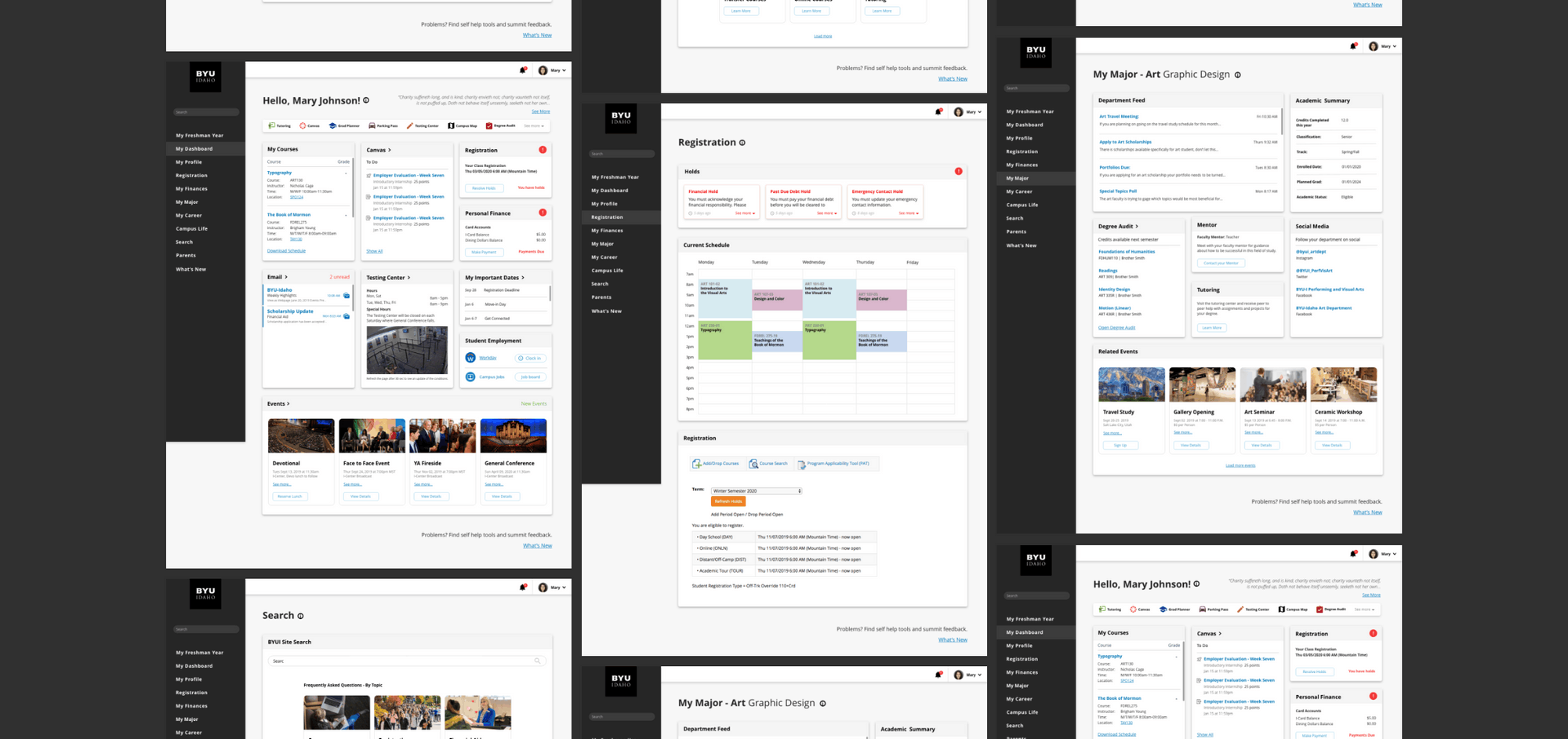
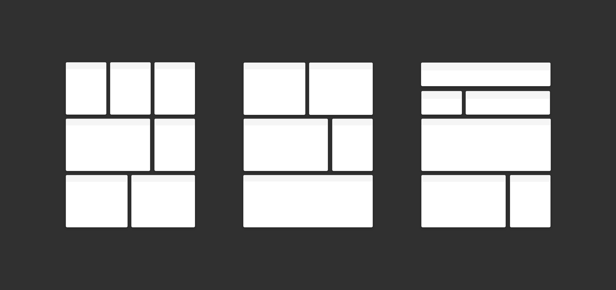
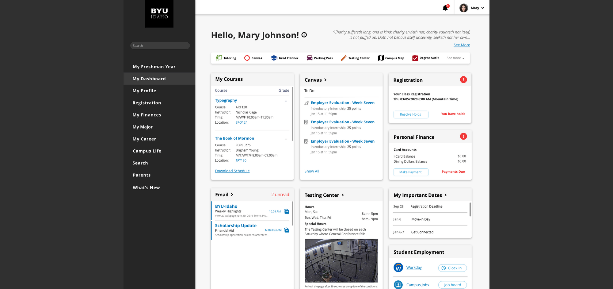
In our version of the student portal, we decided to use a card system. Our reasoning being that we hoped to create something modular that could allow for easy mobile integration and the reuse of cards on multiple pages.
This system uses a 12 column grid with a 30px gutter. The width of the card system can be defined by View Port size.
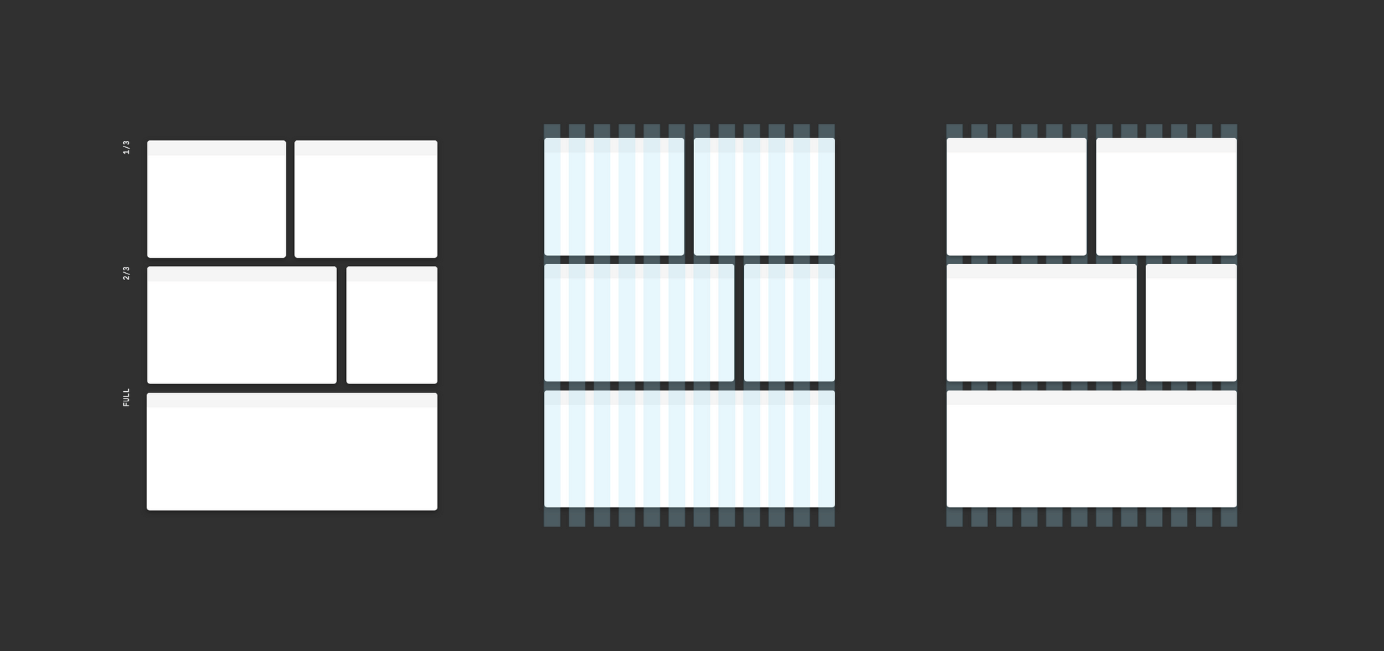
We opted for using a card system that would allow for the right amount of modularity for each page. This gave us the freedom to reuse assets that appear on multiple pages. It also allowed us to easily translate the design into a mobile environment at a later date.
The addition of the side navigation menu was to help organize the overall experience for users.
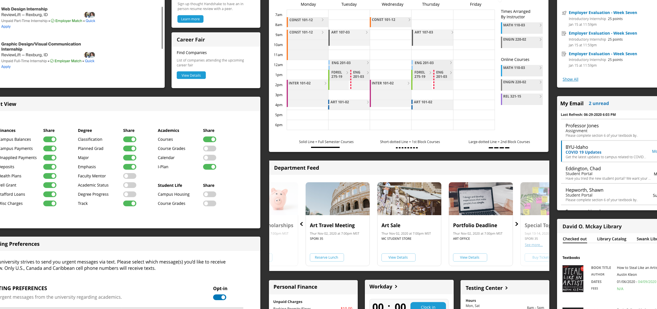
In the first round of testing, we tested 8 people to ensure we were able to find consistent problems with our design. We noticed fairly quickly (about the 3rd test) there was a trend in poor discoverability for a few key features.
Students were having a really hard time finding and using the quick links navigation bar found on the home page, finding where their checked out library books were located, and they had hard time being able to clock in and out of work.
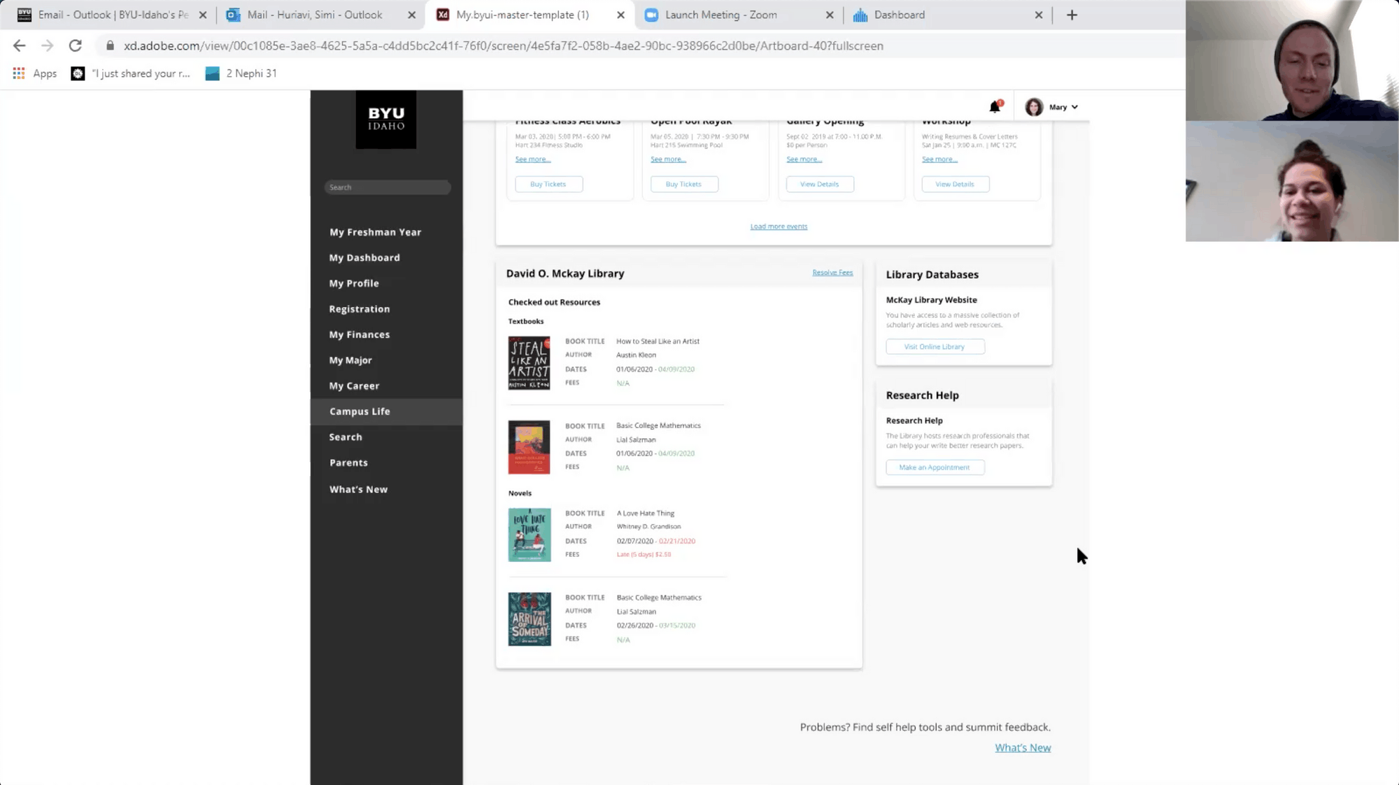
As a team we gathered to talk about our findings. Given that two of our issues had to do with one of our main goal of discoverability we decided to focus our attention of those issues to ensure we were solving the problems we set out to solve.
To help create better discoverability for students trying to check which books they currently have checked out we concluded that there was a need for a new page to contain certain student resources.When searching for the place to clock in students immediately navigated to the "my career" tab which was originally designed as a place for students to get information and help on future careers. We decided to add the workday app as well as a job board feature within the career page to make it an overall work related page.
We concluded that the viewing size of the quick links navigation bar may have been too small due to the screen size that we had set up on XD. By changing the size it made the quick links much more visible.
As a team we gathered to talk about our findings. Given that two of our issues had to do with one of our main goal of discoverability we decided to focus our attention of those issues to ensure we were solving the problems we set out to solve.
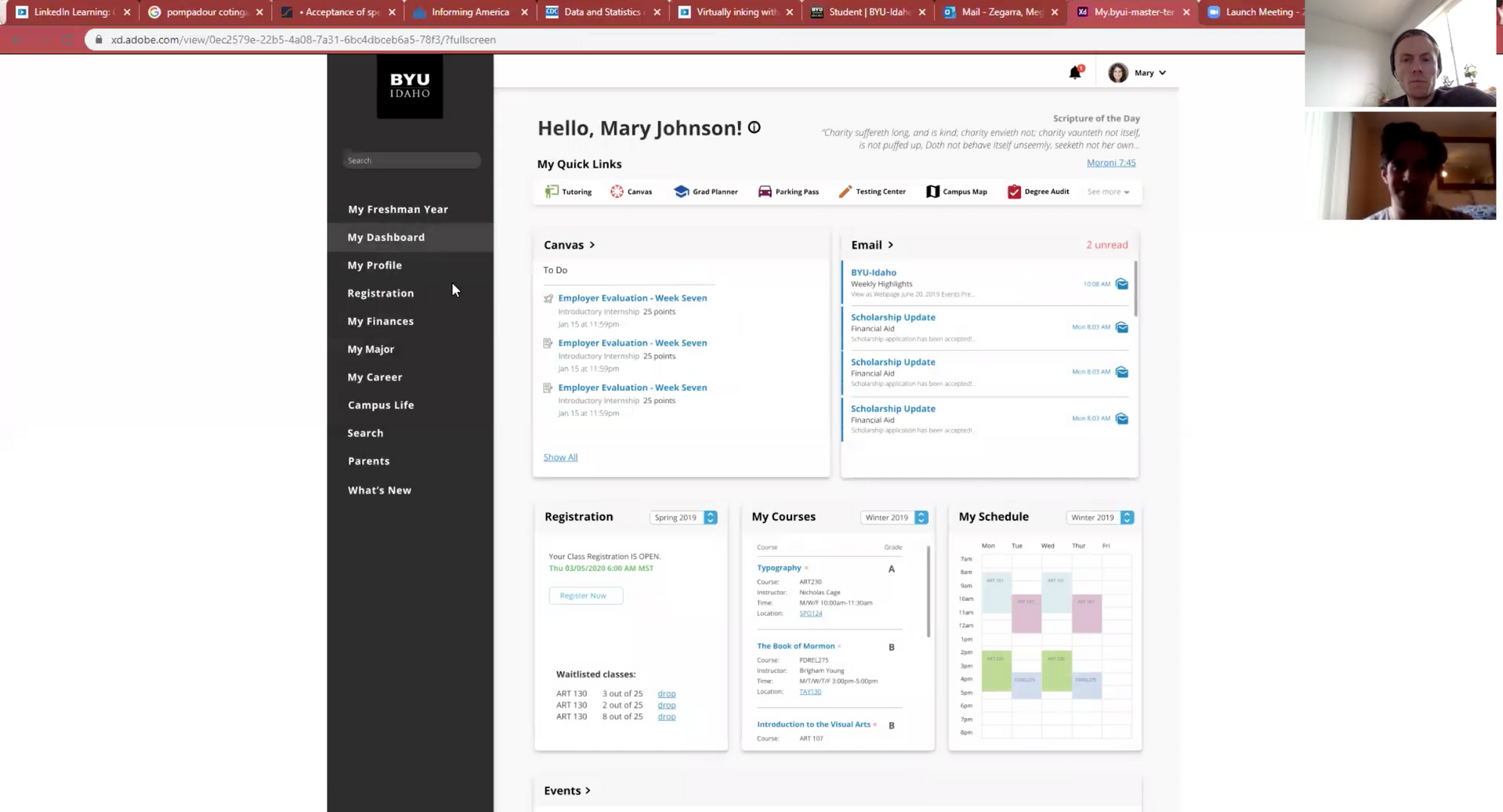
We decided to reorganize the career page to better feature students current employment. As well as, try a new design for the workday card that would feature a more prominent design.

Due to COVID we were unable to do a full launch of the portal. Instead we created a lite version that featured the home page so we could get some feedback from a large number of students.
We did some initial user testing on the quick release of the new student dashboard and learned that it had some issues (Which was expected due to the time frame given).
Students were having a really hard time finding their class list and the section where they can add and drop classes.
Students also had a hard time finding the page to apply for graduation.
Students also didn't see the information below the video.
To solve the issue of students not finding their class list we opted to move that information to the top of the page until three weeks into the semester. At that point, it would drop back down to the bottom.
We found that the page needed for graduation was missing and we needed to add a link to the old page to fill the needs of students for the time being.
Due to the temporary life of this portal management opted to push for the full development of the new portal rather than fix all of the issues with the quick release of the portal.
All in all I feel the create of the portal went pretty well. It was a good lesson in problem solving and it definitely helped push me to grow as a designer. I do feel that towards launch we could have pushed harder to maintain the design language through out the project.