Creating a balanced Car Interface

ROle
Student Designer
Product
Car Interface
Client
College Professor
The Problem
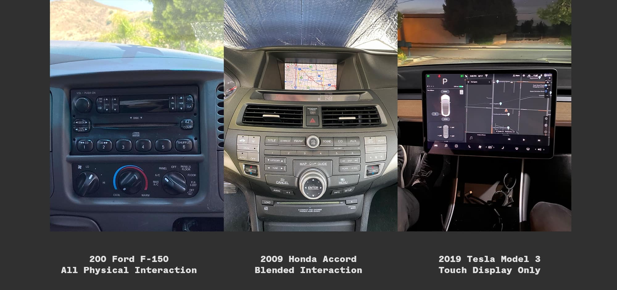
Cars have accrued a lot of functionality over the years. This has left, in my option, interaction with cars to be a confusing experience. Which isn't something you want when driving. As interfaces become more common in CARS, we run the risk of complicating the experience further.
My goals for this project were:
- Clean Intuitive UI
- Explore car interactions
the Process

CAR INTERFACE - DIALS OR TOUCH?
One of the biggest challenges I faced while working on this project was learning how people preferred to interact with a car and deciding whether or not that learned convention was something worth continuing solely because people are used to it. Ultimately, I decided to go with a hybrid of both fully touch-based interaction and button/dial based interaction. This allows things like volume and air temperature to be controlled by a dial while something like using the GPS would be an interaction done only through touch.
Creating Sketches
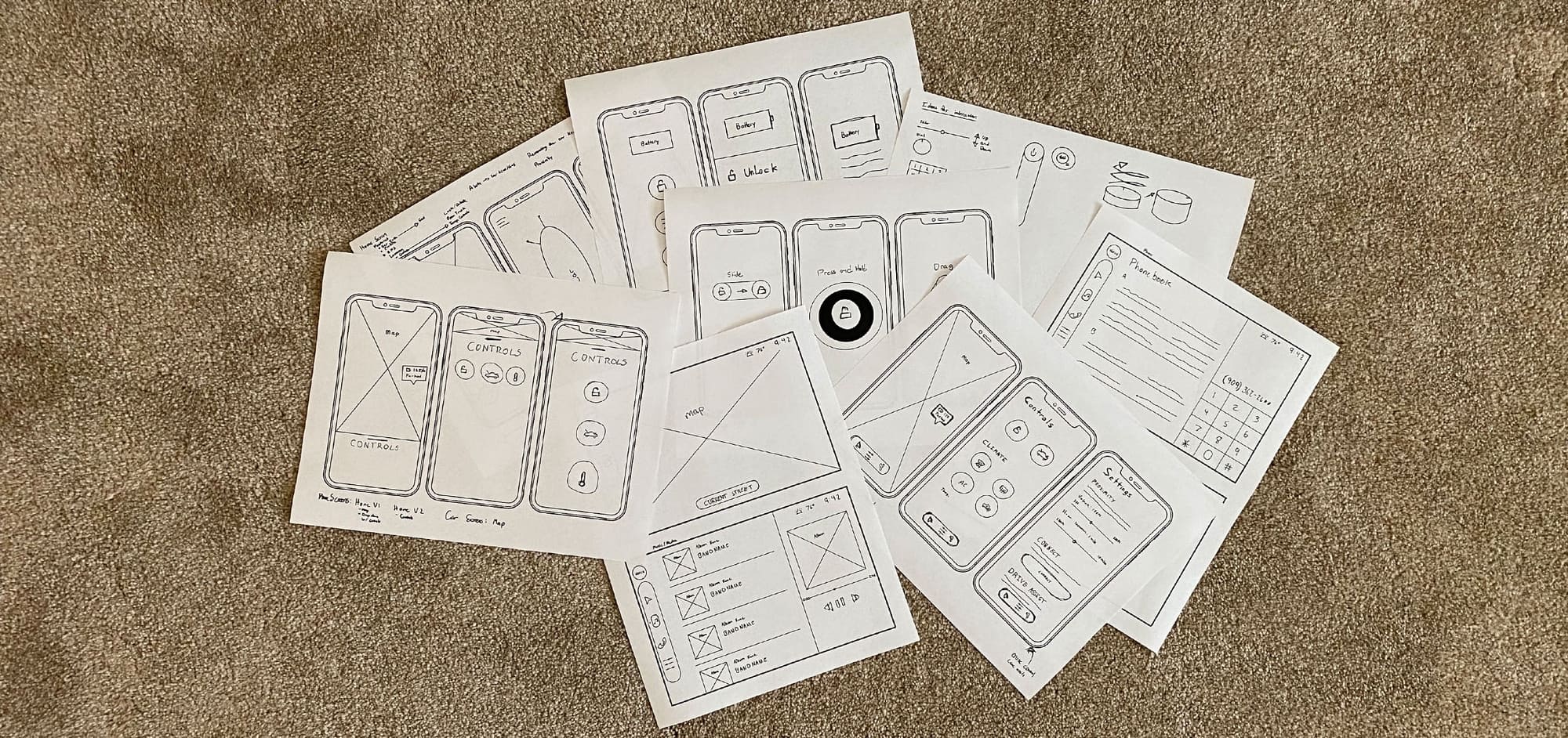
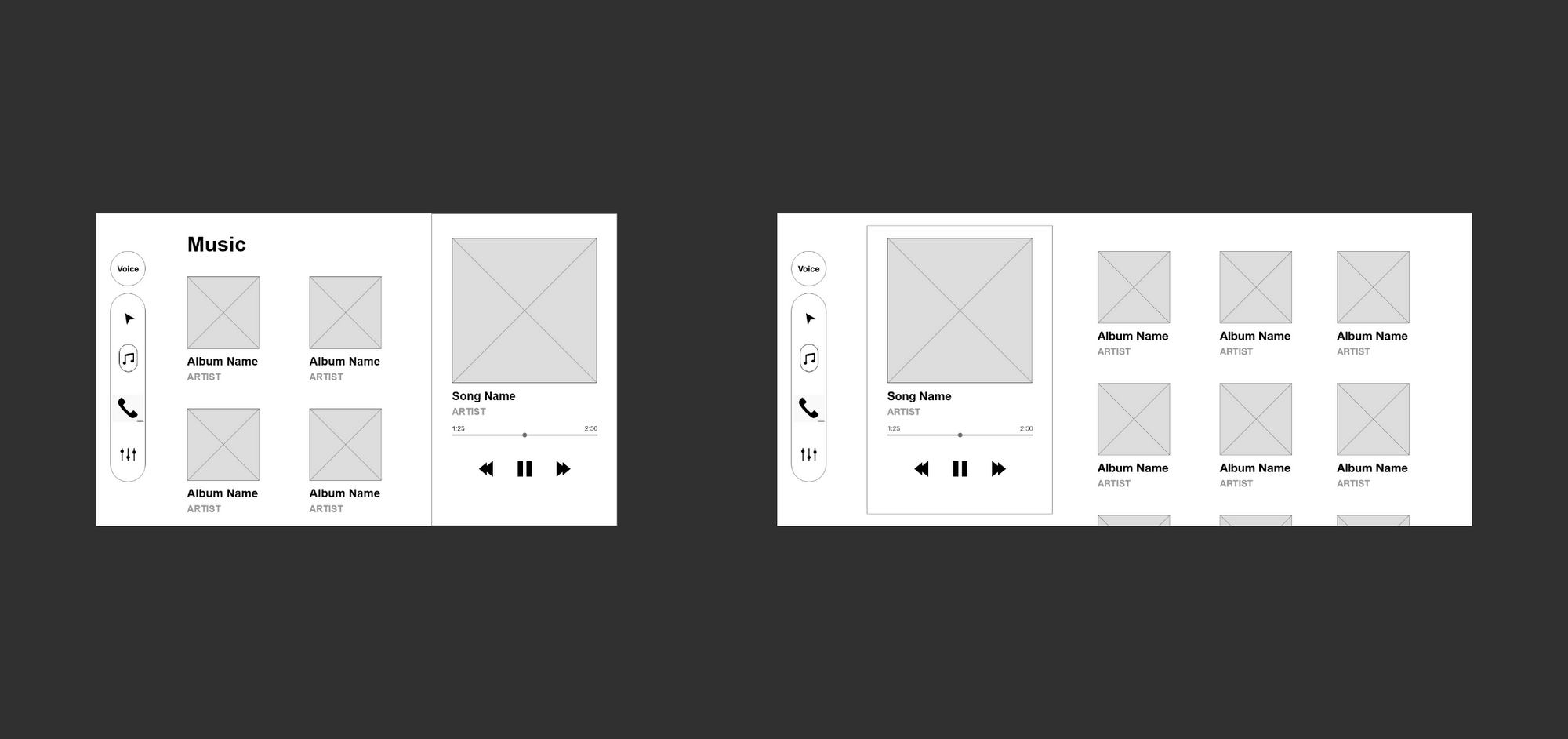
Taking these features I moved into sketching to help get my ideas down on paper. From this process, I was able to rapidly sketch ideas to see how they look to get a feeling of how I'd like to organize the design. I also was able to make some deciding factors of how the user would interact with the in-car interface. I next moved on to wireframing to help organize my overall thoughts.
User Testing Round 1

User Test Round 1
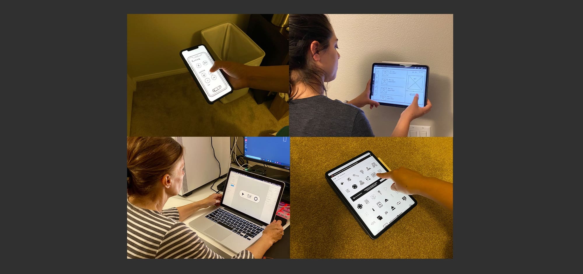
After completing the sketches I chose some designs to scan. After downloading the images on devices I moved on to user testing. This round I tested 3 people on various things like understanding of icons and following scenarios.
Scemarios
- Your friend is borrowing your car and they told you they would return the car by 5 pm. It's well past 5 pm and you're wondering where they're at. Use the car companion app to find the location of your car.
- You're listening to a song while driving that you don't like very much. You decide to go to the next song using the car interface. Go ahead and go to the next song.
- It's a really hot summer day and you need to go to the store but you're dreading getting into a hot car. You remember you can turn on the air conditioning with the car companion app. Use the app to cool down your car.

Changes
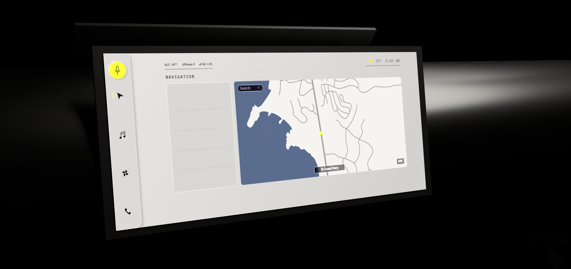
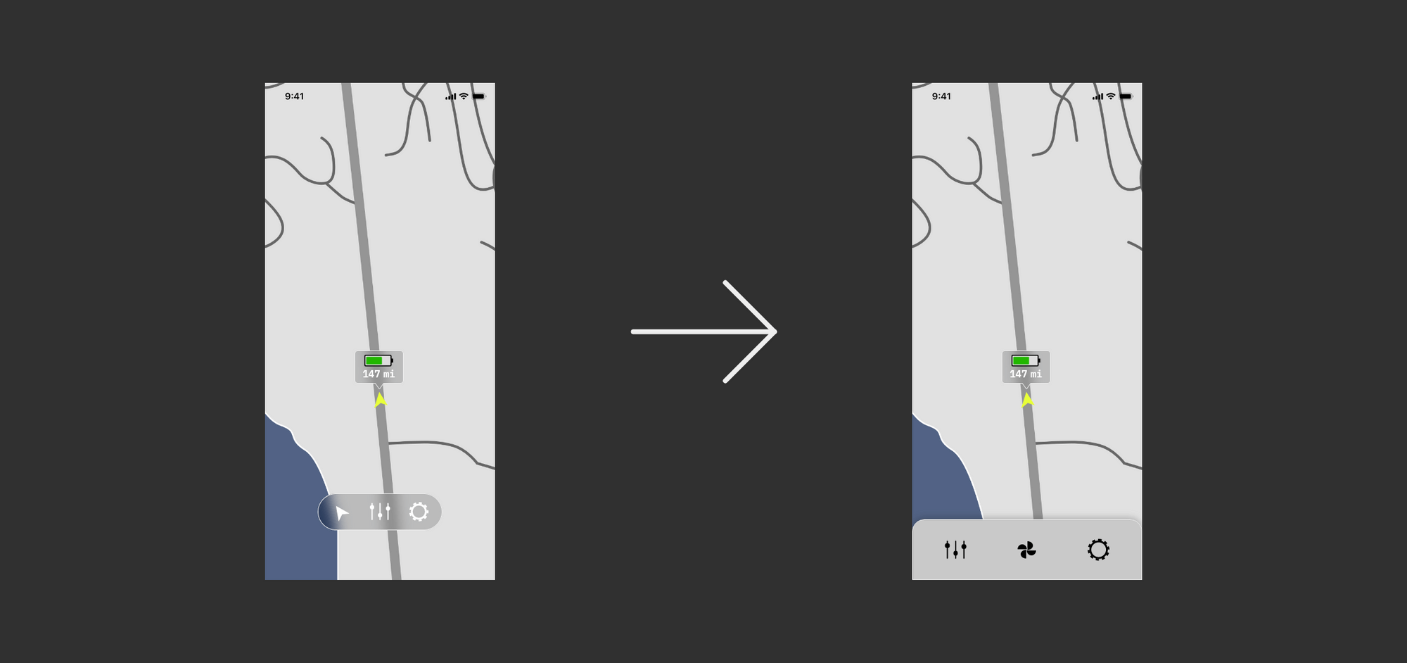
From these tests, my users asked a lot of good questions I didn't have good answers to. There are a few features that I may be missing on some pages (Climate rather than controls) and the need for a larger screen size is becoming more apparent. This will be a big change but it's 100% necessary to fill the needs of the user. On the phone interface, users asked why the options don't match the car interface.
User Testing Round 1

Style
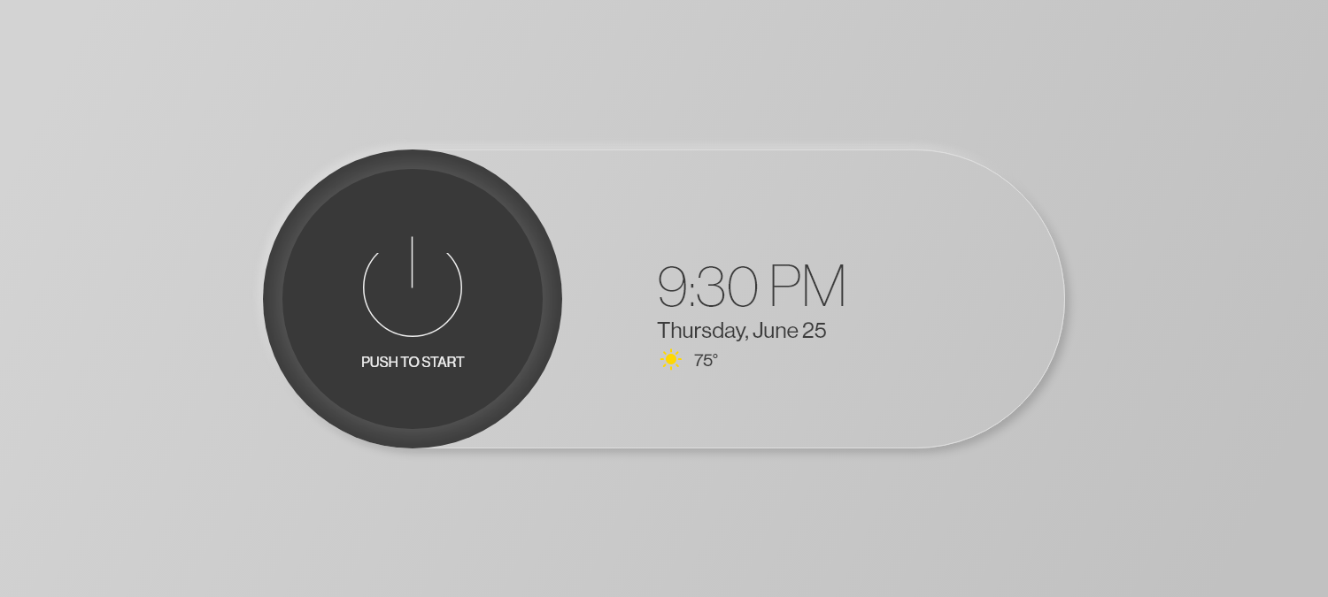
The design was inspired by light and how it interacts with our environment. I wanted to explore a more 3D space as opposed to a flat design. For that reason, I chose a neomorphic style to follow.
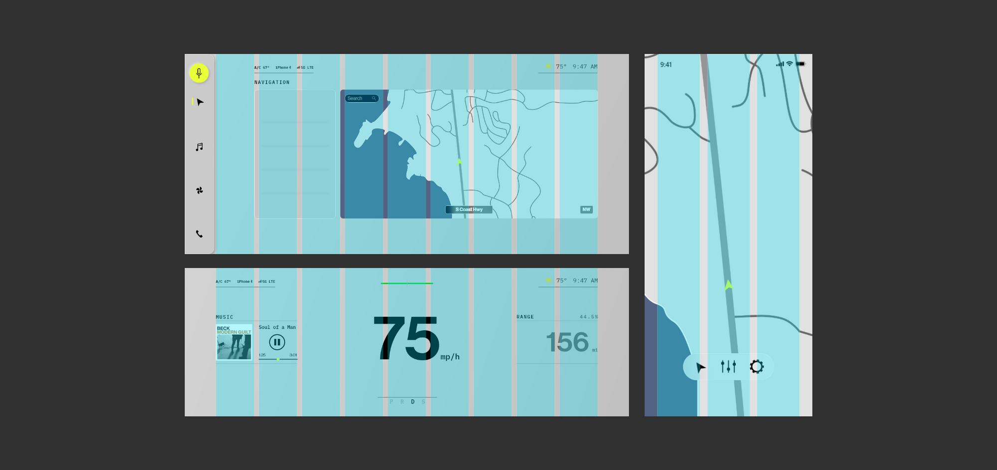
grid
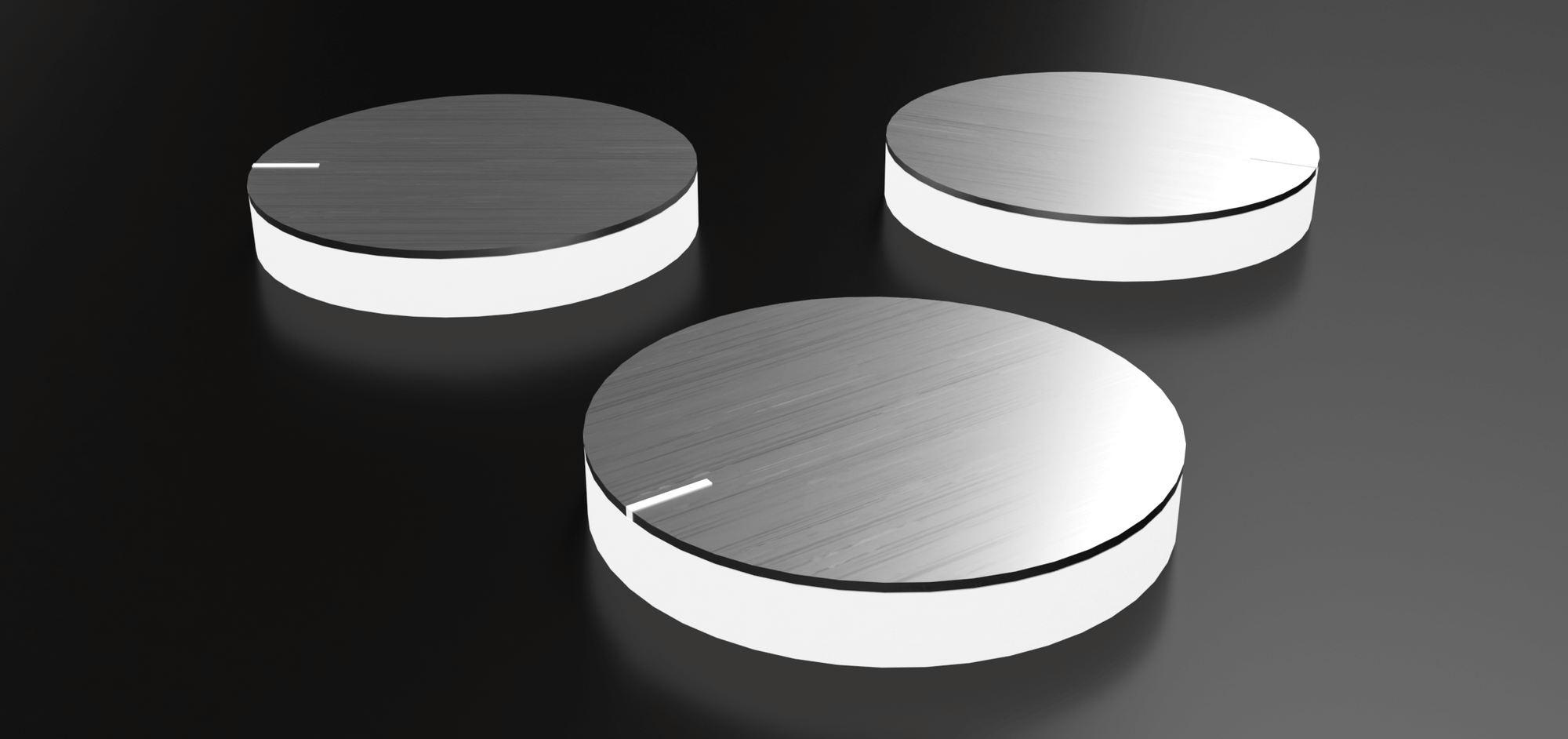
I wanted to design some of the physical elements just to push myself a little bit. Here's a little showcase of a knob I made. I was following the same inspiration as the overall design.
Colors
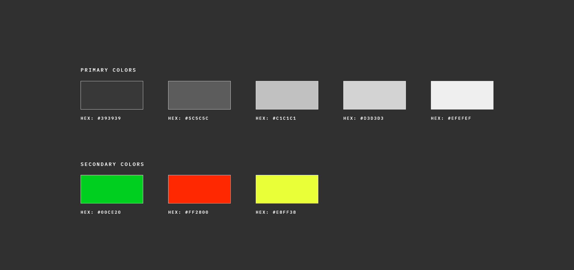
There's a lot of grey but I have a good reason. When looking at shadow we mostly see a shade of grey. For that reason, I chose to keep the primary colors grey but add life through secondary colors.
Physical Buttons
I wanted to design some of the physical elements just to push myself a little bit. Here's a showcase of a knob I made. I was following the same inspiration as the overall design.
Branding
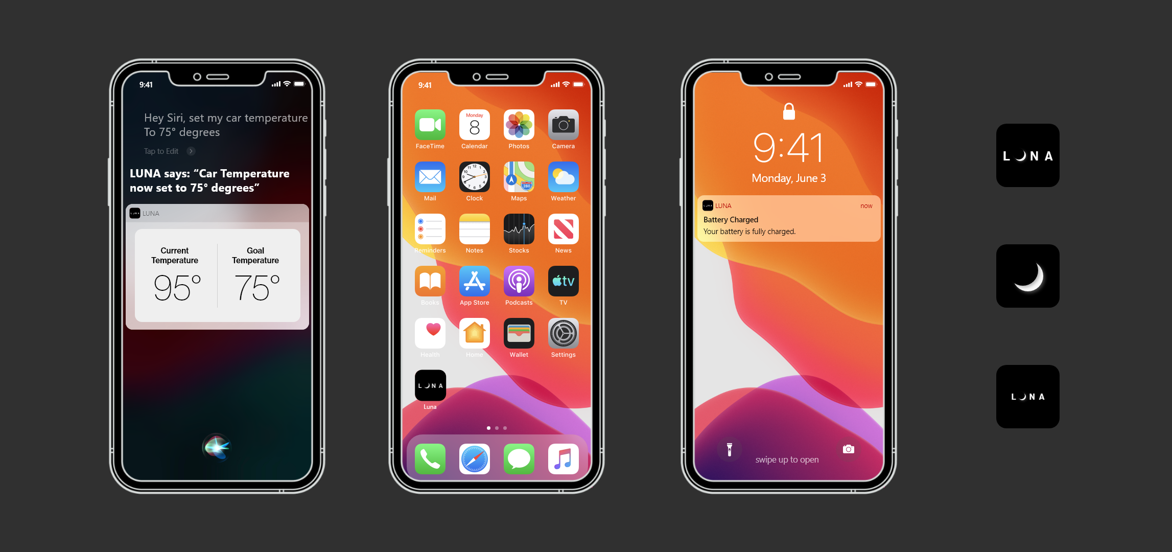
When designing for the iPhone I decided to take some of these elements provided by Apple to create some branding mock-ups of the app icon as well as some other screens.
Typeface
In this design, I used IBM Plex Mono in different weights and sizes for most of the text. For the numbers and larger text, I used Neue Haas Grotesk Display Pro.
User Testing Round 2

Scemarios
- Your friend is borrowing your car and they told you they would return the car by 5 pm. It's well past 5 pm and you're wondering where they're at. Use the car companion app to find the location of your car.
- You're listening to a song while driving that you don't like very much. You decide to go to the next song using the car interface. Go ahead and go to the next song.
- It's a really hot summer day and you need to go to the store but you're dreading getting into a hot car. You remember you can turn on the air conditioning with the car companion app. Use the app to cool down your car.
Changes
This round of usability testing was enlightening. A pattern quickly developed with finding how much of a charge the car had. I also was able to get some feedback on the overall design of things. One thing brought to my attention was the inconsistency of design.
Final Design
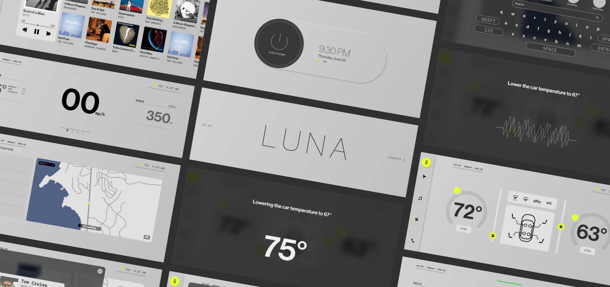
Now that both interfaces feel complete and are functioning the way they're supposed to it's time to start focusing on the details of design and adding those finishing touches. Below is a style tile that shows elements included in the design.
Details

Details
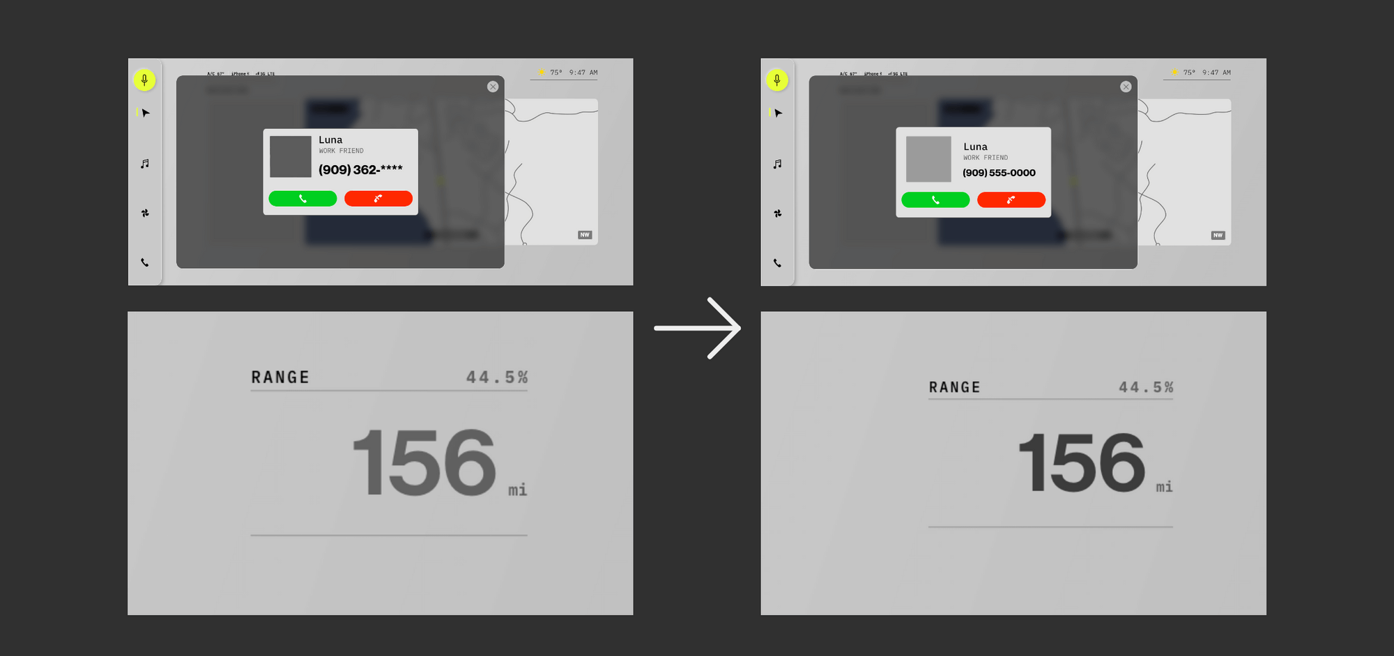
After getting everything in place I started to comb through the design to fix some UI elements that needed some touch-ups. Down below is a small example of some of those changes.
Creating Motion
Motion is a huge part of UX design. Not only does it help things look finished it plays a key role in giving the user feedback and helps them visualize a state change.
USING MOTION AS FEEDBACK
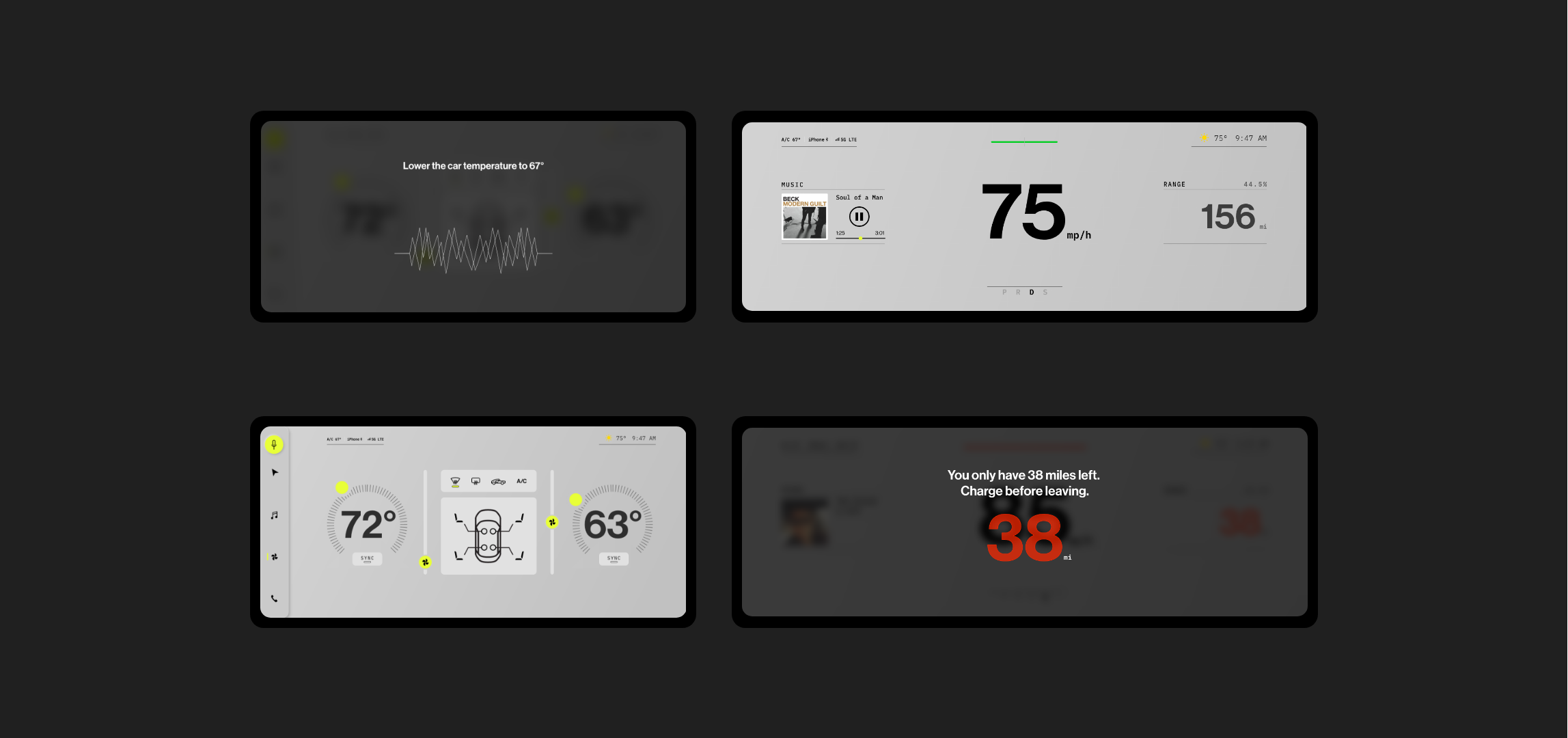
The great part about adjusting volume and temperature is that you receive feedback through other senses. You can hear the sound get louder and you can also feel the temperature change but it's also just as important to get that visual feedback as well.
USING MOTION AS FEEDBACK
The great part about adjusting volume and temperature is that you receive feedback through other senses. You can hear the sound get louder and you can also feel the temperature change but it's also just as important to get that visual feedback as well.
Stuff
I had a lot of fun creating things for this design. This is just a showcase of some of the things I that could be part of the finished design that hasn't been properly user tested or implemented.
Using Proximity for the in Car Interface
Here are some examples of what proximity sensor on the car interface could afford some users.
HAND GESTURES
While I was trying to come up with inventive ways of interacting with the car I was reminded of attempts to add hand gestures to control cell phones. This great idea could be utilized in a car to help users control their vehicles without needing to look for targets on the screen.
Biometrics Scanning
I also thought that biometric scanning could be used in cars too. Things like face scanning, eye tracking, and fingerprint readers could add a lot of interesting functionality to a car.
